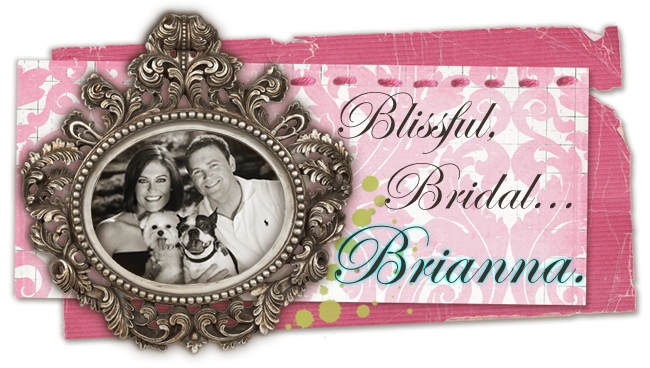
As I'm sure everyone is aware, I am SO excited about the success of our engagement pictures!! What everyone might not be aware of is the fact that I was waiting on the engagement pictures to complete the Save the Dates. I'm actually designing them myself and having the design put onto a magnet. I have designed 3 similar versions of the Save the Date using 3 different engagement pictures so we can send everyone a Save the Date with the picture we feel they will prefer. My designs aren't completely perfected or 100% final, so I'm not posting them yet... but I will definitely post the designs when they're completed!
On another note, I visited an adorable stationery shop in Fort Worth called Byrd + Bleecker, which is conveniently located only about 2 miles from my house, to see in person some wedding invitations that I have been scoping out online. I think I have narrowed down the selection to 2, but the problem is that I love each of them for very different reasons. They are comparably priced, so I can't really use that as a deciding factor.
Here are my two finalists, accompanied by reasons I love them...
Picture this: Where the peach color is there would be lavender and where the red color is there would be amethyst.
- I love this design... The peony design is so elegant, timeless, and rich with southern flair. I love the Parisian elements as well.
- All pieces are beautifully letterpressed.
- Lots of font options.
- Free envelope printing for return address.

Picture this with the yellow flowers on the bottom (as pictured), but with amethyst colored text, and lavender edge painting (although you can't see the edges in this picture).
- I LOVE THE PAPER!!! That sounds silly, but a sorority sister of mine (Katie "Glonek" Day) used Smock Letterpress for her wedding invitations and the recycled bamboo paper is super thick and feels so rich and amazing. It was unlike any invitation I had ever seen when I received mine from her.
- I LOVE THE FONTS! Smock has 2 fonts available which are designed after the hand calligraphy of a famous calligraphist, therefore the letterpress text on your invitation makes people double take on whether it was done by a computer or if it was hand scribed and then pressed.
- EDGE PAINTING! This is such a fabulous option, in my opinion! The edges of your invitation can be hand painted a color that compliments your invitation (since the paper is pretty thick and the edges are wide enough to notice if they are a different color). I remember receiving Katie's invitation and thinking how unique and truly different it was that the edges of the invitation were a different color... I also pondered for quite a while how that was even achieved! Beautiful touch!
- I guess the main thing I don't like as much about this invitation is the design... I like the Parisian Peony design better, but I love all of the little detailed elements that this company has to offer.
Decisions, decisions!
I'm going to talk to my mom about her opinions on each of them also, so I will keep you posted on the decision making process!


0 comments:
Post a Comment